Best Fonts for Technical Writing Portfolio
Presenting yourself online properly is important and assists in getting a job in the highly competitive technical writing sector. You want to make a good impression on potential employers with your portfolio website, which is often their first point of contact. Your portfolio should be highly organized, from design to content, to showcase your skills and background.
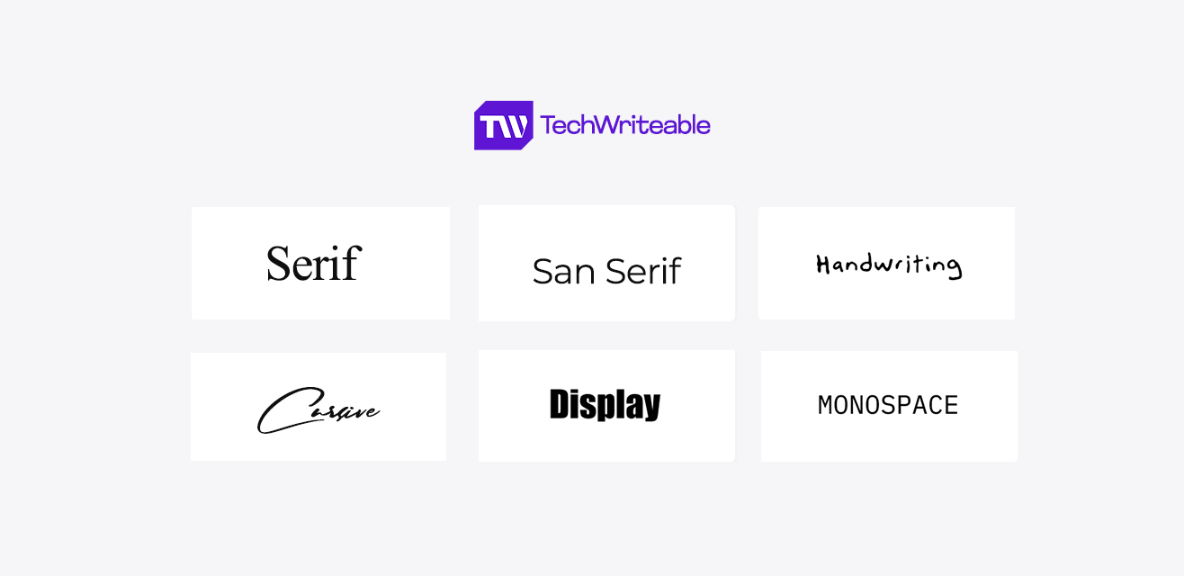
For your portfolio, font choice is paramount. This enhances your portfolio’s visual appeal and shapes visitors’ perceptions of your identity, professionalism, and trustworthiness. This post will discuss the benefits of choosing the right fonts, which ones to use, and even which fonts power Techwriteable’s portfolio website.
Why Your Font Choice Matters
Font choice is a frequently ignored aspect of portfolio design. The fonts you choose can greatly impact the overall appearance and feel of your website, as well as how visitors perceive your professionalism and knowledge. A well-chosen font not only reflects your style but also ensures that your audience interacts with your work intuitively. Some reasons why your font choice is important are:
- Ease of readability and navigation
- Sense of professionalism and credibility
- Establishment of brand identity
10 Best Fonts to Use for Your Technical Writing Portfolio
Here are ten carefully selected fonts for your portfolio to strike a balance between readability and professionalism:
1. Glancyr
Glancyr is a modern, geometric font design. It is quite readable and suitable for both headings and body text. It is one of the font styles we use at Techwritable.
Its sharp lines and open curves make it very legible on the web and in print, making it ideal for creating user interfaces and technical reports. Consider Glancyr to give a modern touch to your next technical document or user guide.
Pros:
- Clean and modern design
- Highly readable
- Works well for both headings and body text
- Suitable for a variety of technical writing projects
- Good for user interfaces
Cons:
- Can appear too sterile or corporate in some contexts
- It can be overused due to its unique design
- Might be less legible in very small print or on low-resolution screens
2. Montserrat
Montserrat is another famous font design that is both professional and adaptable. It has a somewhat more fun feel than Glancyr and is a wonderful choice for portfolios looking to add some flair. Montserrat is a flexible font that looks great in headlines and body text.
Its broad letterforms and open letter spacing rendered it easy to read even on tiny screens. Montserrat can make your website or technical presentation stand out and easy to understand. Montserrat is a font style that we use after Glancyr at Techwritable.
Pros:
- Professional and versatile
- Slightly playful feel
- Good for both headings and body text
Cons:
- It is a common and widely used font
3. Open Sans
Open Sans is a sleek, open-source font ideal for technical writing. It’s quite readable and suitable for both large and small font sizes. The ever-popular Open Sans font is both neutral and adaptable.
Its sleek, geometric shape combines nicely with a variety of design styles, giving it a safe but effective option for technical writers. If you’re looking for a dependable font that won’t overshadow your content, Open Sans could be the ideal choice for your next technical paper or user interface.
Pros:
- Clean and open-source
- Highly readable
- Works well for all text sizes
Cons:
- It can appear too generic
4. Roboto
Roboto is a clean and professional font style that Google uses across a variety of products. It is a versatile font suitable for a range of applications, including technical writing portfolios.
Roboto is a sleek and professional font designed by Google that is widely used in the computer industry. Its neutral look and good legibility make it a popular choice for user interfaces, online design, and even technical documentation. If you want your tech writing projects to have a modern and approachable feel, Roboto could be a solid choice.
Pros:
- Clean and professional
- Versatile
- Highly readable
Cons:
- It is frequently used and, hence can be overused
5. Lato
Lato is a friendly and open-source font design that is suitable for portfolios that need to be approachable and easy to read. It is a humanist font that mixes warmth and utility. Its softly rounded letterforms and balanced style promote readability without appearing overly sterile.
Lato is an excellent choice for tech writing that requires a personal touch, such as blog articles or marketing materials.
Pros:
- Friendly and approachable
- Open-source
- Highly readable
Cons:
- It can appear too casual for some audiences
6. Source Sans 3
Source Sans 3 is a clean, professional font that comes in a variety of weights and styles. This makes it a versatile font suitable for a wide range of applications, including technical writing portfolios.
This open-source font family is a popular choice for user interfaces and web design because of its clarity and flexibility. Its neutral style makes it suited for a wide range of technical writing assignments, such as user manuals and presentations.
Pros:
- Clean and professional
- Versatile
- Highly readable
Cons:
- It is frequently used and, hence can be overused
7. Merriweather
Merriweather is another font with a timeless and graceful appearance. It’s an excellent choice for portfolios seeking to communicate authority and tradition.
Looking for a font that is approachable and readable? Merriweather has a pleasant and welcoming demeanor while maintaining outstanding legibility, making it ideal for long technical articles or ebooks.
Pros:
- Classic and elegant look
- Conveys a sense of authority and tradition
- Highly readable
Cons:
- It may not be as suitable for all types of technical writing
8. PT Sans
PT Sans is a clean, modern sans-serif font inspired by the iconic Helvetica font. It’s an excellent choice for portfolios that require a clean and professional appearance without being overly generic.
This geometric font has a clean and professional design, thereby making it ideal for technical writing that demands a neutral and modern touch. Its clean letterforms provide readability in a variety of applications.
Pros:
- Supports a wide range of languages
- Freely available for personal and commercial use
- It is highly readable
Cons:
- It might not be the best choice for large headlines or titles
9. Fira Sans
Fira Sans is a geometric font that has been optimized for screen reading. It’s an excellent choice for technical writing portfolios that will be predominantly seen on digital devices to ensure great readability.
Fira Sans is a humanist font that emphasizes readability and usability. Its open letterforms and balanced style make it ideal for a wide range of technical writing assignments, like web interfaces and presentations.
Pros:
- Designed for optimal readability on screens
- Clean and modern aesthetic
- It is highly readable
Cons:
- It may not be suitable for printed materials
10. IBM Plex Sans
IBM Plex Sans is a professional and adaptable font available in a variety of weights and styles. It’s a wonderful choice for technical writing portfolios that require a font that can be adjusted to fit diverse design aspects.
This flexible font family blends functionality with a unique personality. Its clean and legible design makes it appropriate for a variety of technical writing tasks, while the minor features provide a touch of professionalism.
Pros:
- It is professional and versatile
- It has a wide range of weights and styles
- It is highly readable
Cons:
- It is frequently used and, hence can be overused
Frequently Asked Questions
Q1. What font does TechWriteable use?
TechWriteable uses Glancyr for headings and Montserrat for body text. These fonts were chosen for their readability, versatility, professionalism, and unique appearance on websites.
Q2. Can I change the font on my TechWriteable portfolio?
Currently, you can not change the font on your TechWriteable portfolio. However, we are constantly working to improve our platform, and this is something we might add down the line.
Q3. What factors should I consider when selecting a font for my technical writing portfolio?
When choosing a font for your technical writing portfolio, consider readability, professionalism, versatility, and brand identification. Try to stay away from highly trendy or playful fonts in a professional setting.
Accelerate Your Career Progression with the TechWriteable Portfolio Platform
One part of developing a good technical writing portfolio is choosing the correct fonts. TechWriteable portfolio platform gives you all the tools and features you need to build a professional and impressive portfolio that will help you get your dream job.
TechWriteable includes a user-friendly drag-and-drop interface, customizable templates, powerful writing and editing capabilities, collaborative features, and much more!
Sign up for a free TechWriteable account today and discover how our platform may help you advance your technical writing career.
Discover TechWriteable’s different SaaS tools and productivity hacks to enhance your technical writing journey.


